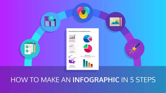
Designing Infographics: Crafting Visual Stories with Style. Step into the world of infographics where creativity meets data, and visuals tell compelling stories that captivate and inform.
From understanding the basics to mastering design tools, this guide will take you on a journey through the art of creating visually engaging infographics.
Understanding Infographics Design
Infographics are visual representations of information, data, or knowledge designed to present complex information quickly and clearly. They combine text, images, and graphics to convey a message in a visually appealing way.
Key Elements of a Well-Designed Infographic
When creating an infographic, it is essential to include key elements such as:
- Clear purpose: Every infographic should have a specific goal or message it aims to communicate.
- Engaging visuals: Use eye-catching graphics and images to draw the viewer’s attention.
- Concise content: Keep text brief and to the point to avoid overwhelming the audience.
- Data accuracy: Ensure that any data or statistics presented are reliable and from credible sources.
Importance of Visual Hierarchy in Infographics
Visual hierarchy plays a crucial role in guiding the viewer’s attention through an infographic. By using different sizes, colors, and placement of elements, you can prioritize information and create a flow that leads the viewer from one point to the next.
Role of Color Theory in Infographic Design
Color theory is essential in infographic design as it can evoke emotions, convey messages, and create visual interest. Choosing the right color palette can help establish a brand identity, highlight key information, and make the infographic more visually appealing.
Planning and Research
When it comes to designing infographics, planning and research are key components that can make or break the effectiveness of your visual communication. By carefully gathering data, identifying your target audience, incorporating storytelling, and organizing content, you can create impactful infographics that resonate with your viewers.
Research Process for Gathering Data
Researching for infographics involves collecting accurate and relevant data to support your message. This can include conducting surveys, analyzing reports, studying trends, and referencing reputable sources. It’s crucial to fact-check and verify all information before incorporating it into your infographic to maintain credibility.
Identifying Target Audience
Understanding your target audience is essential for creating infographics that effectively communicate your message. Consider demographics, interests, and preferences to tailor your design and content to resonate with your viewers. Conducting audience research and creating user personas can help you identify the needs and preferences of your target audience.
Importance of Storytelling
Storytelling plays a crucial role in infographic design as it helps engage viewers and make complex information more digestible. By structuring your content in a narrative format, you can guide your audience through the information and create a compelling visual story. Incorporating a beginning, middle, and end can help create a cohesive and engaging infographic.
Organizing Content Before Designing
Before diving into the design phase, it’s essential to organize your content in a clear and logical manner. Create an Artikel or storyboard to map out the flow of information, highlight key points, and ensure a cohesive narrative. Breaking down information into sections, using headers, and incorporating visual hierarchy can help guide viewers through the infographic seamlessly.
Design Tools and Software: Designing Infographics

When it comes to creating stunning infographics, having the right design tools and software can make all the difference. Let’s dive into some popular options and explore their features.
Popular Design Tools
- Adobe Illustrator: Known for its versatility and powerful design capabilities, Illustrator is a favorite among graphic designers for creating detailed and intricate infographics.
- Canva: A user-friendly platform with a wide range of templates and design elements, Canva is perfect for beginners looking to create professional-looking infographics quickly.
- Piktochart: This online tool offers a variety of customizable templates and drag-and-drop features, making it easy to design visually appealing infographics.
Comparing Design Software Features
- Illustrator: Offers advanced design features and precise control over every element, but has a steeper learning curve.
- Canva: User-friendly interface with pre-designed templates and easy customization options, suitable for beginners and those looking to create infographics quickly.
- Piktochart: Online platform with a range of templates and customization options, ideal for creating visually engaging infographics without extensive design experience.
Benefits of Using Templates
- Save time: Templates provide a starting point for your design, helping you quickly create an infographic without starting from scratch.
- Consistent design: Templates ensure a cohesive look and feel throughout your infographic, maintaining visual harmony.
- Inspiration: Templates can spark creativity and offer design ideas that you may not have considered on your own.
Choosing Typography and Fonts
- Consider readability: Choose fonts that are easy to read and understand, especially when conveying important information.
- Match the tone: Select typography that aligns with the overall theme and message of your infographic, enhancing the visual impact.
- Avoid clutter: Limit the number of fonts used in your design to maintain a clean and cohesive look, typically sticking to 2-3 complementary typefaces.
Visual Elements and Layout

When it comes to creating effective infographics, the visual elements and layout play a crucial role in conveying information in a clear and engaging manner. Icons, illustrations, graphics, charts, and images all contribute to making an infographic visually appealing and easy to understand. Let’s dive into some key aspects of visual elements and layout in infographics.
Use of Icons, Illustrations, and Graphics, Designing Infographics
Icons, illustrations, and graphics are essential components of an infographic as they help convey complex information in a visual format. When using icons, make sure they are clear, relevant, and consistent in style throughout the infographic. Illustrations can be used to add a creative touch and enhance the overall design. Graphics such as charts and graphs are effective in presenting data and statistics in a visually appealing way.
Tips for Creating Visually Appealing Charts and Graphs
When creating charts and graphs for infographics, it’s important to choose the right type of visualization based on the data you want to present. Use colors strategically to differentiate between data sets and make sure the labels are clear and easy to read. Simplify complex data by using straightforward visuals that are easy to interpret at a glance.
Best Practices for Selecting Images for Infographics
Images play a significant role in capturing the attention of the audience and adding context to the information presented in an infographic. When selecting images, opt for high-quality visuals that are relevant to the content and enhance the overall message. Choose images that align with the style and tone of the infographic to maintain consistency in the design.
Importance of Whitespace and Alignment in Infographic Layout
Whitespace, also known as negative space, is essential in infographic design as it helps prevent visual clutter and allows the content to breathe. Proper alignment of elements ensures a clean and organized layout, making it easier for the audience to navigate through the information. Utilize whitespace strategically to create a balanced composition and guide the viewer’s eye towards key points within the infographic.
Data Visualization Techniques
When it comes to creating effective infographics, data visualization techniques play a crucial role in conveying information in a clear and engaging manner. By representing data visually, you can make complex information easier to understand and more memorable for your audience.Charts, graphs, and maps are commonly used in infographics to present data in a visually appealing way. Charts, such as bar graphs or pie charts, are great for showing comparisons or proportions between different data sets.
Graphs, like line graphs or scatter plots, are useful for illustrating trends or relationships in the data. Maps can be utilized to display geographic data or regional variations.Interactive elements can also enhance data visualization in infographics by allowing viewers to interact with the data. For example, interactive charts or graphs that respond to user input can provide a more engaging experience and enable users to explore the data in more depth.To create clear and understandable data visualizations, it’s essential to keep the following tips in mind:
- Choose the right type of visualization for your data and the message you want to convey.
- Use colors strategically to highlight important information and create a visually appealing design.
- Avoid clutter and unnecessary elements that can distract from the main message.
- Provide clear labels, titles, and legends to help viewers understand the data being presented.
- Test your data visualizations with a sample audience to ensure they are easy to comprehend.
Examples of Data Visualization Techniques
- Bar graphs: Ideal for comparing data sets and showing trends over time.
- Pie charts: Great for illustrating proportions and percentages.
- Line graphs: Useful for displaying trends and patterns in data.
- Interactive maps: Allow users to explore geographic data interactively.